Deva Activewear
Naming, Visual Identity, Typography, 2026
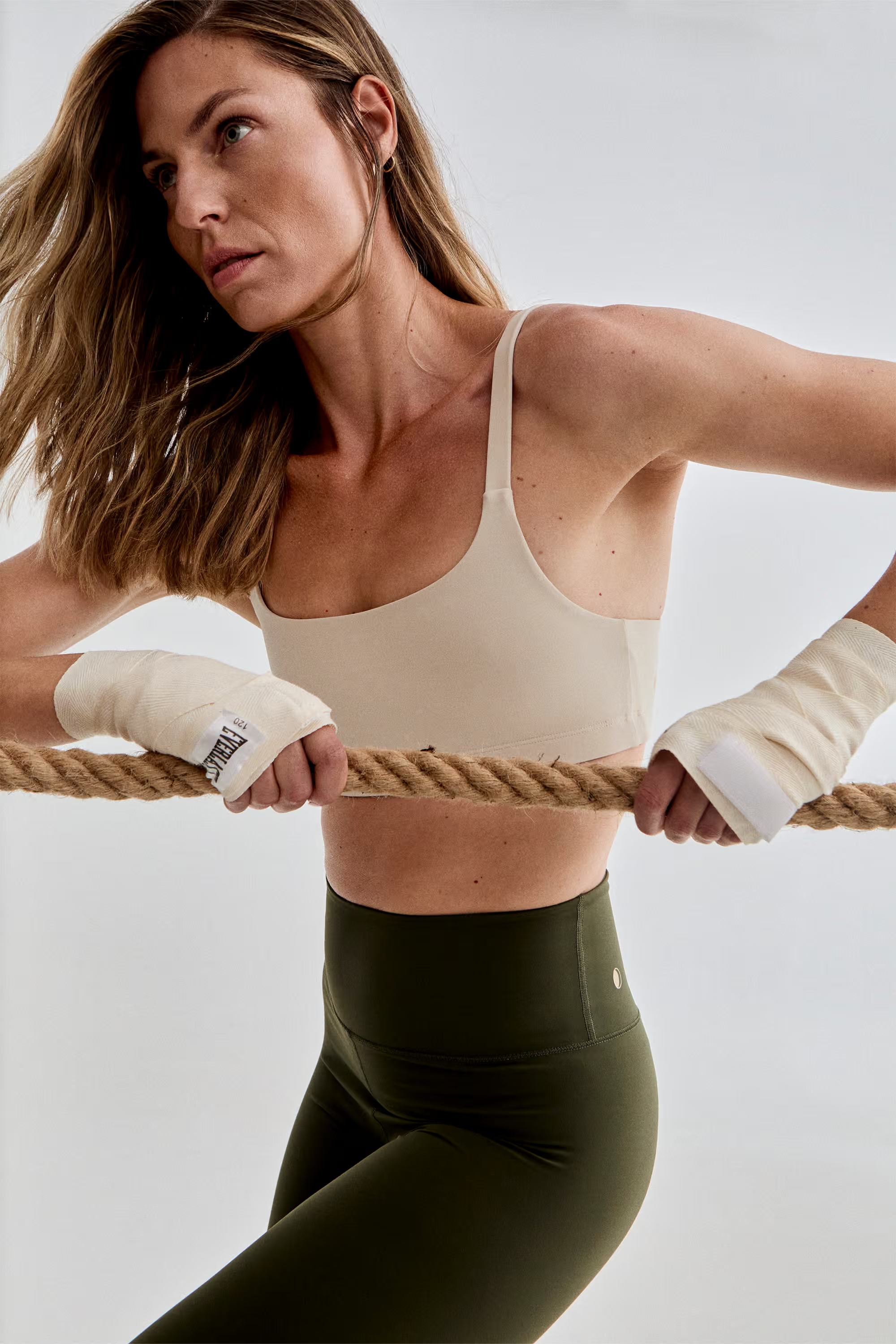
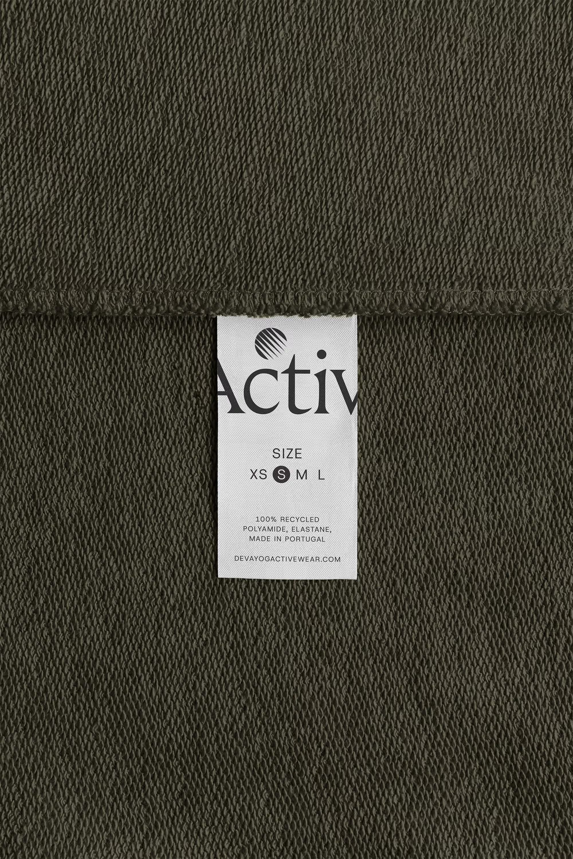
Visual identity and repositioning for Deva Activewear, a premium sustainable activewear brand designed in Mallorca and handmade in Portugal. The new identity transforms Deva from a yoga-specific label into a broader activewear brand, combining an inscriptional serif wordmark with a symbol inspired by garment construction, mindful movement and the brand’s origins.
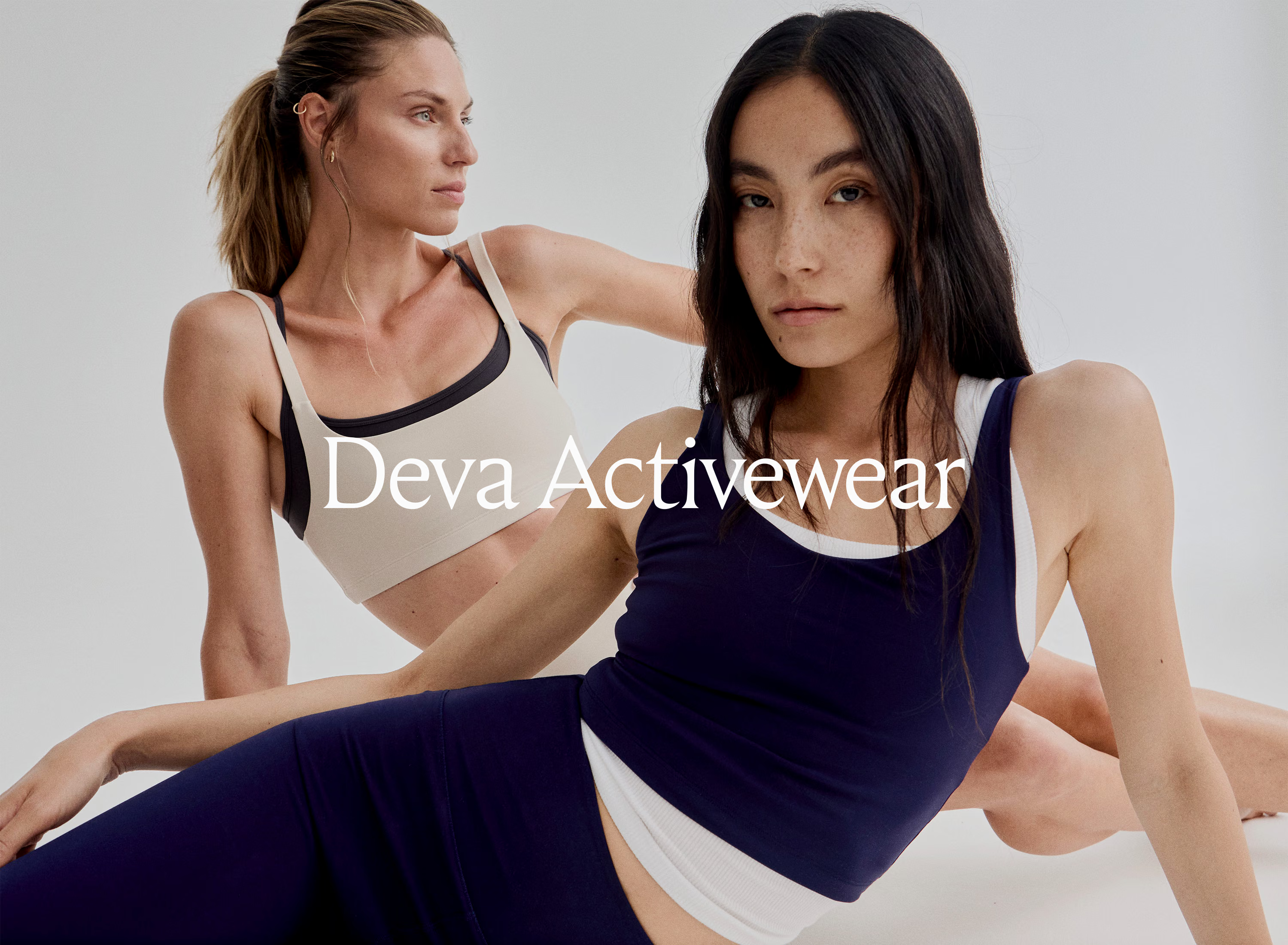
Deva began as Deva Yoga, a project shaped by founder Victoria Rosselló’s fifteen years of yoga practice and her deep connection to movement, travel and conscious living. But as the product evolved, the name and identity began to define the brand too narrowly. Customers associated Deva almost exclusively with yoga, while Victoria’s ambition was to reach a wider audience: conscious women with an interest in sport, wellbeing, sustainability and considered design. The first decision was therefore structural rather than visual: Deva Yoga became Deva Activewear, opening the brand to a much broader idea of movement.
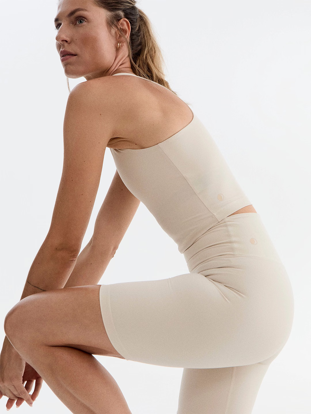
The new identity needed to reflect that change in positioning. The previous logo belonged naturally to the visual language of yoga and wellness, whereas the redesign moved Deva Activewear closer to contemporary fashion, craftsmanship and understated luxury. Instead of following the geometric sans serifs that dominate the activewear category, the new wordmark uses Fautive Light, a serif with roots in nineteenth-century lettering inspired by Roman inscriptions. Its history is relevant here, but more importantly, its character gives Deva something the category often lacks: elegance, timelessness and a sense of craft.
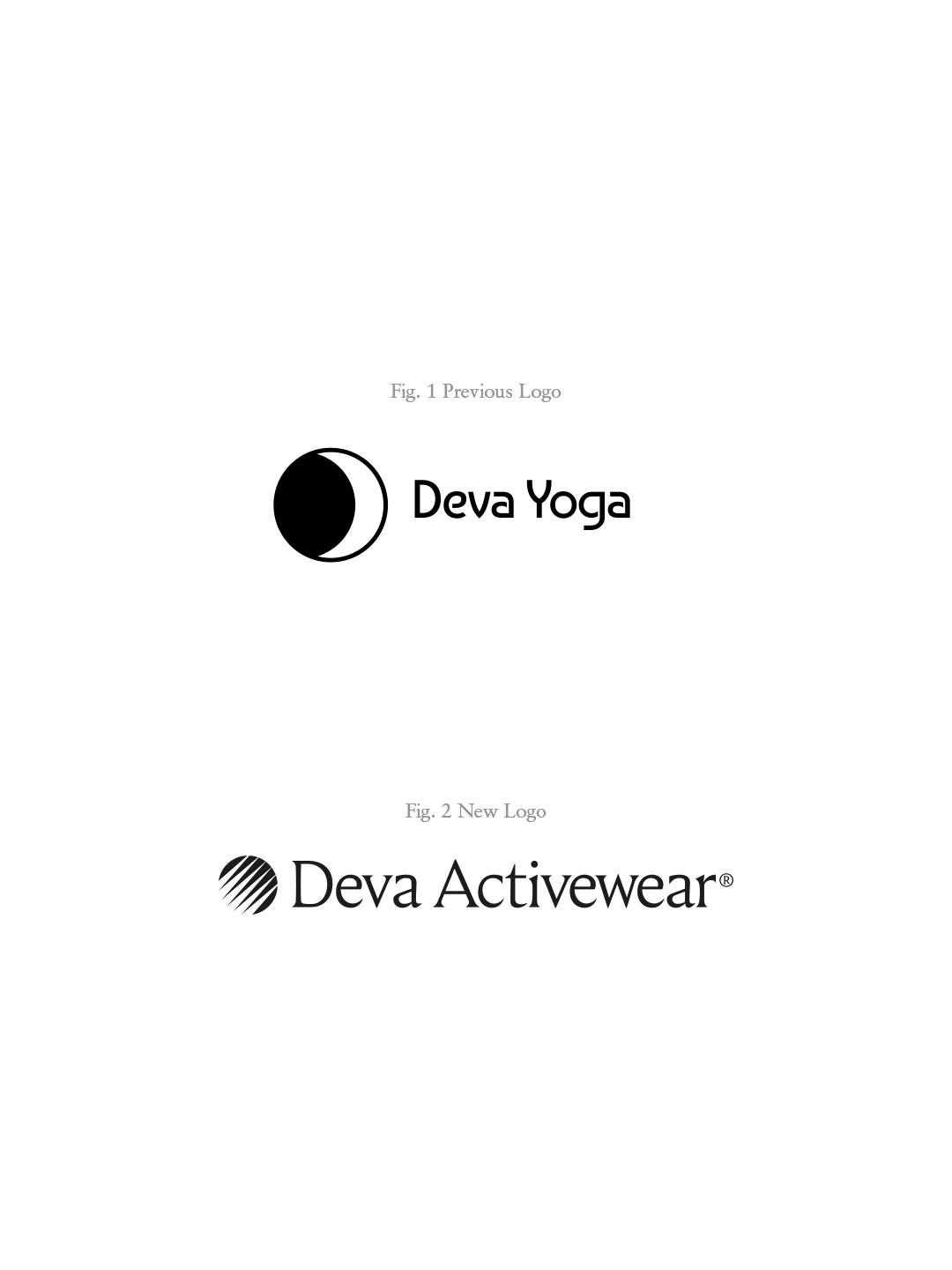
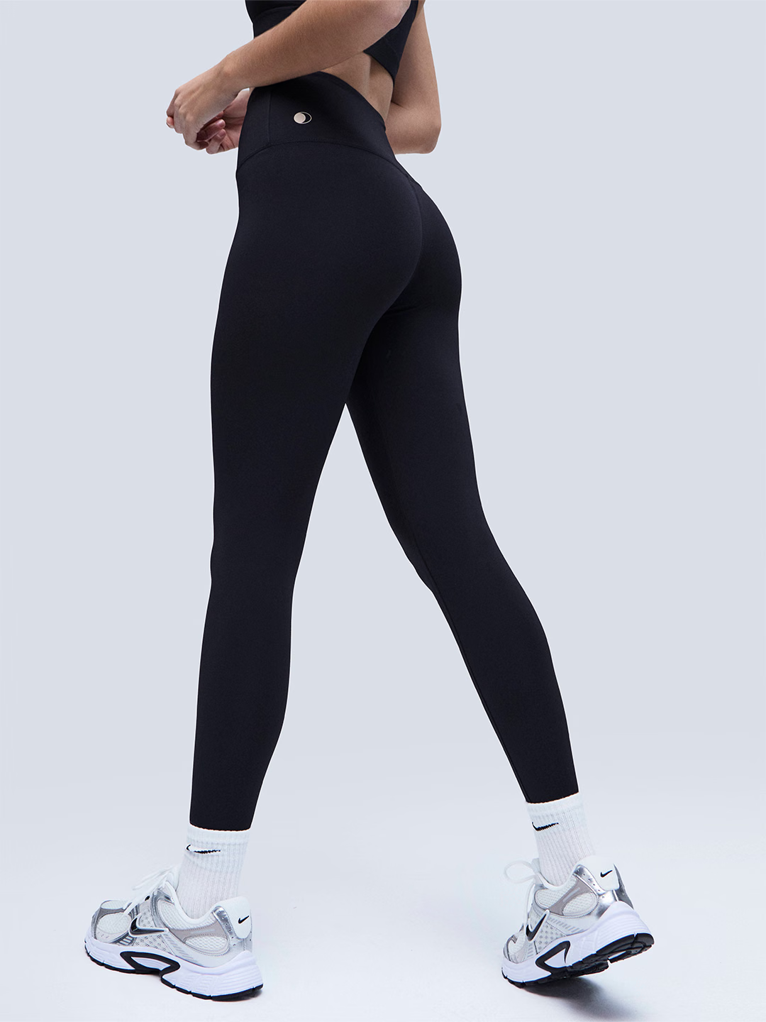
The wordmark was carefully reworked to give the typography more space, balance and presence. Letter spacing and kerning were adjusted individually, creating a calmer and more refined rhythm while retaining the distinctive character of the typeface. Around it, a wider typographic system gives the brand flexibility: EB Garamond brings an editorial quality to storytelling and longer texts, while Host Grotesk Light handles practical information such as pricing, sizing and digital interfaces. Together they balance editorial character with a subtle sense of luxury.
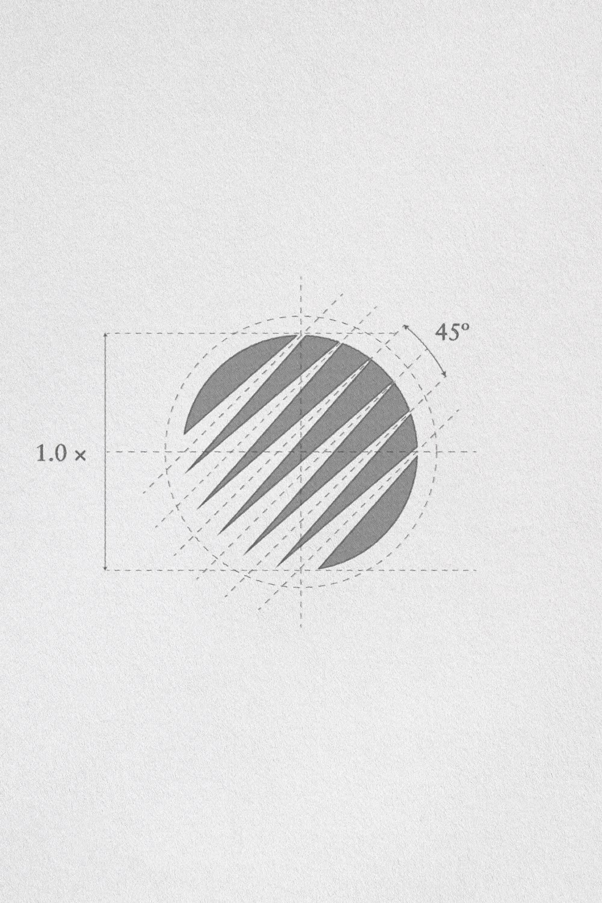
The symbol retains the strongest memory of the previous identity without carrying its literal meaning forward. The original crescent moon is reduced to its circular geometry and reconstructed through seven diagonal strokes set at 45º. The angle references the bias direction used in garment construction, where fabric gains flexibility and responds more naturally to the body and its movement. The seven strokes quietly allude to the seven chakras, preserving Deva’s connection to yoga as part of its history rather than allowing it to define the brand. What was once a symbol of yoga becomes a symbol of movement, construction and transformation.
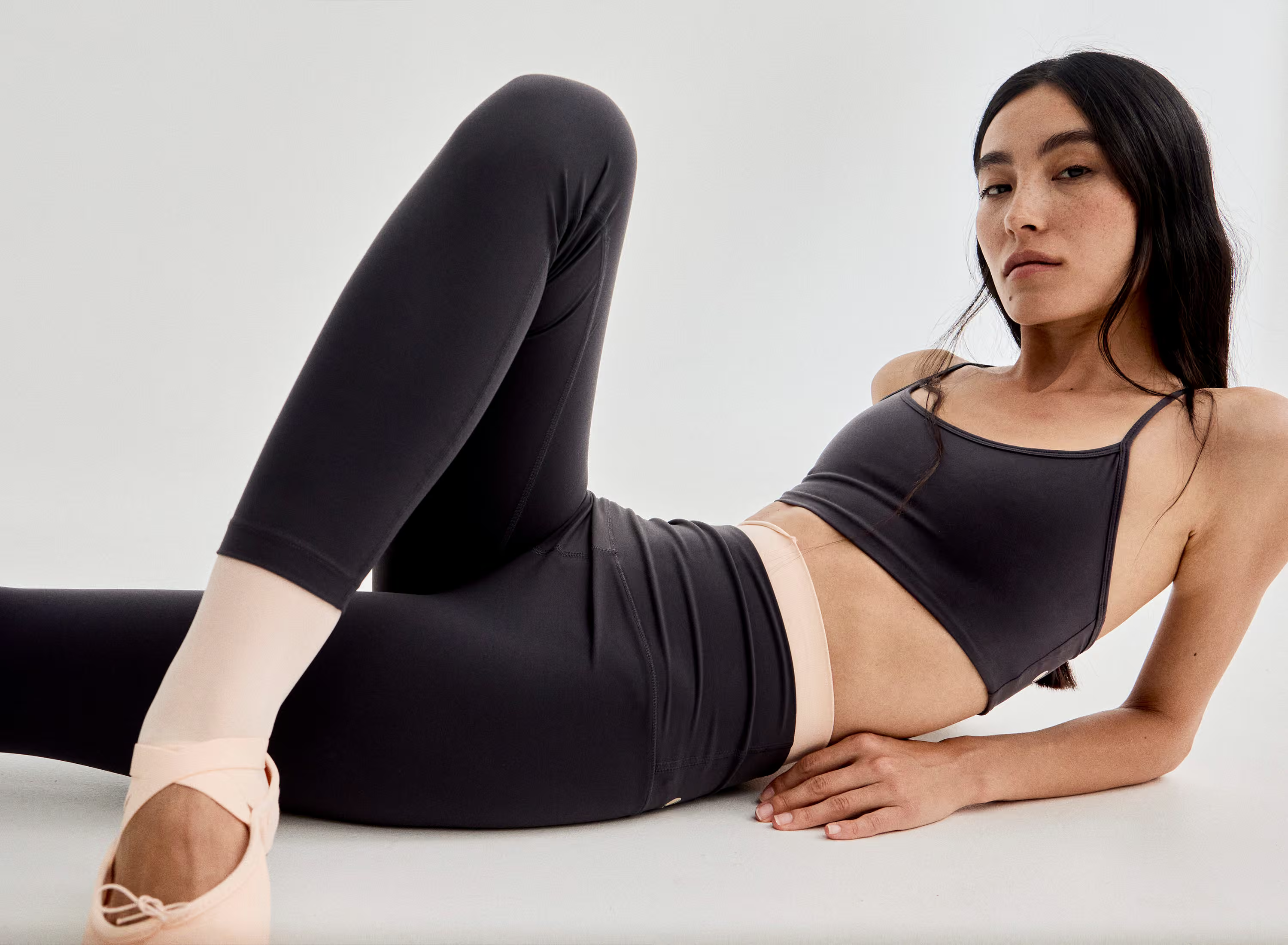
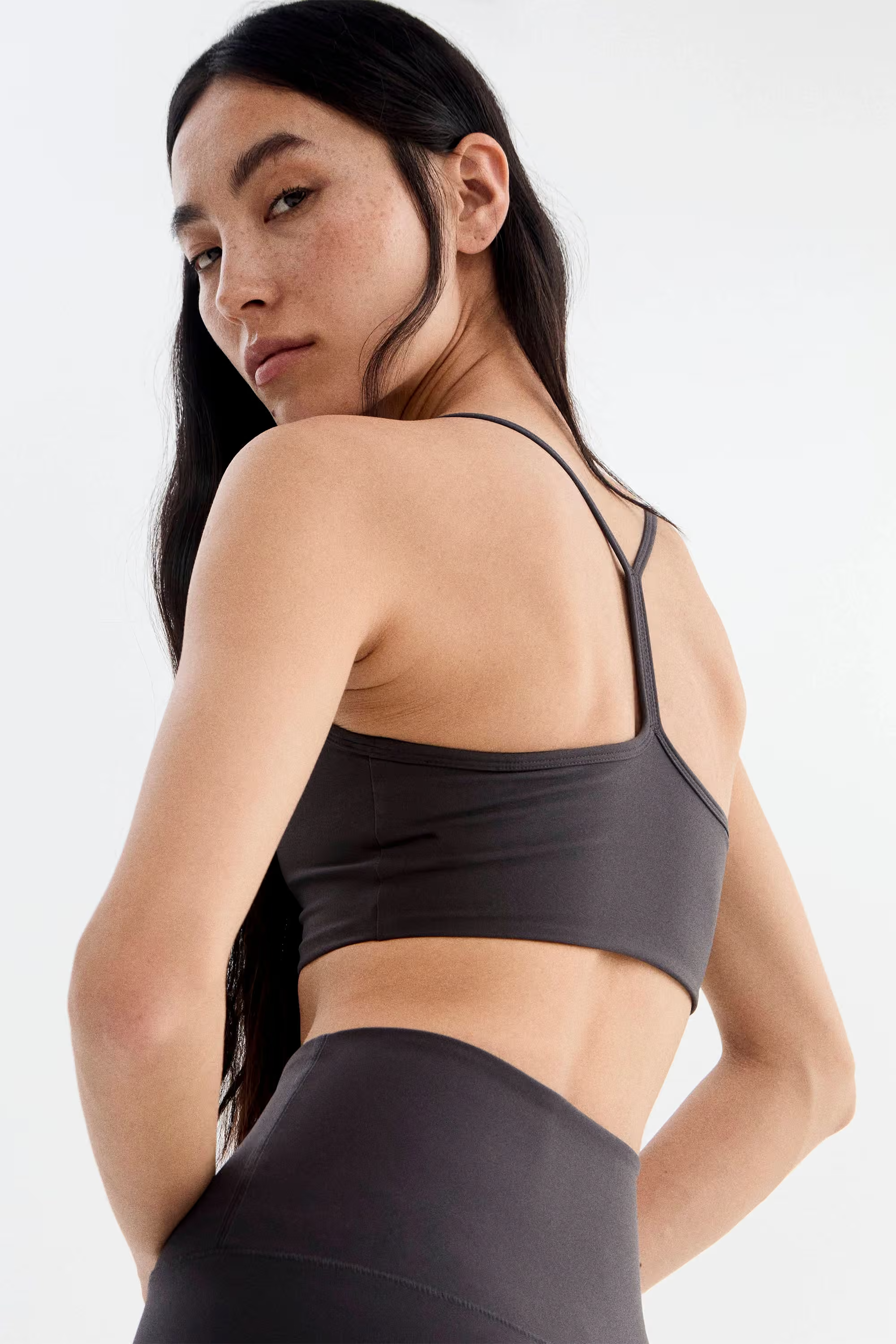
The product remains at the centre of that positioning. After fifteen years teaching yoga, Victoria turned her experience into a collection she designs herself, informed by her travels, different cultures and her relationship with the sea and nature. Conceived not only for yoga but for Pilates, fitness, hiking, training and everyday movement, Deva works with premium Repreve® and Carvico® fabrics made from recycled plastics and marine waste, supported by U-Trust® and OEKO-TEX® certifications. The garments are made in regulated workshops in Portugal and produced in limited quantities to reduce overproduction, combining comfort, breathability and durability with a more conscious approach to fashion.
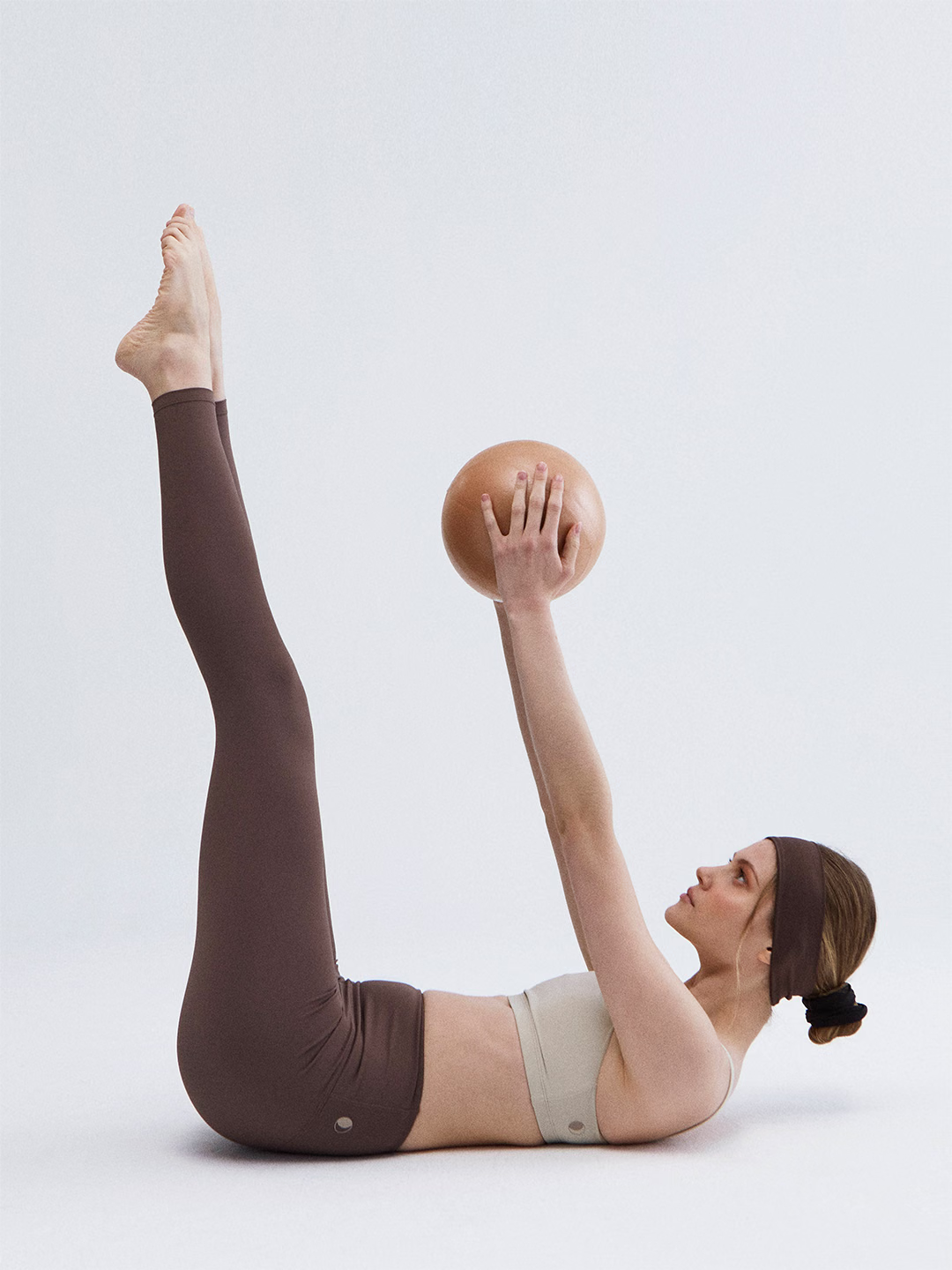
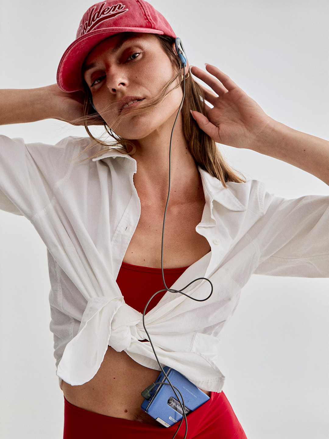
The identity was developed in one week and resolved through a single round of revisions. Following its rollout, Deva reported a 15% increase in sales and a rise in conversion rate from 0.3% to 2%. More importantly, the repositioning freed the brand from the limits of a single discipline and gave it a platform for a broader vision: premium, sustainable activewear designed for movement in all its forms. Deva Yoga was the origin. Deva Activewear is the ambition.
Colophon
Year
2026
Client
Deva Activewear
Industry
Fashion, Premium Activewear
Services
Naming, Visual Identity, Typography, Art Direction.
Deliverables
Naming, logotype, symbol, lockups, and typographic system.
Role
Naming, art direction, and design.
Typefaces
Fautive Light (by Fred Wiltshire for Blaze Type).
EB Garamond (by Georg Mayr-Duffner and Octavio Pardo).
Host Grotesk (by Doğukan Karapınar and İbrahim Kaçtıoğlu).
Applications
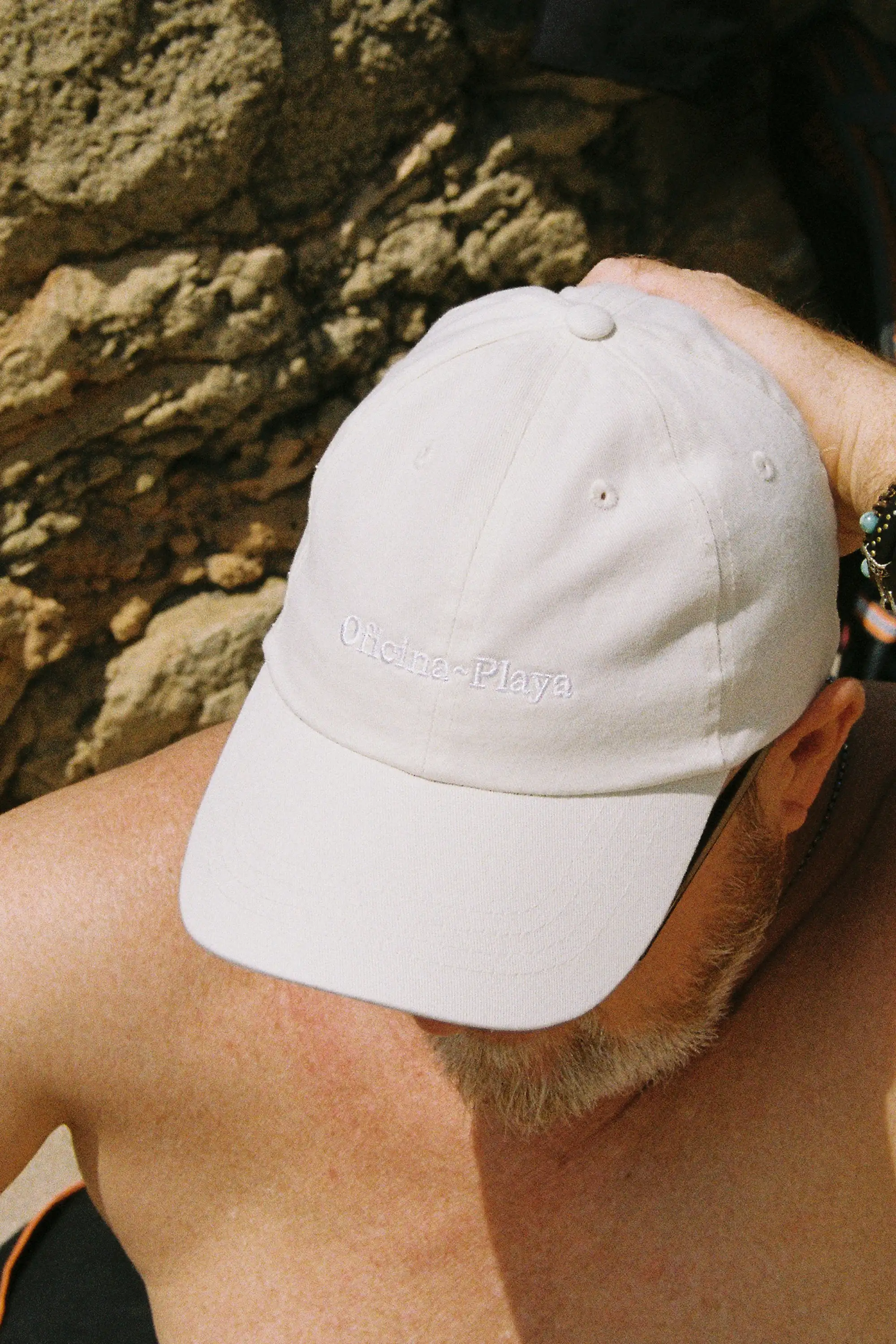
Web, e-commerce, embroidery, garment labelling, packaging.
Production
Handmade in Portugal using recycled fabrics.
Timeline
One week.
Outcome
+15% in sales following rollout.
Conversion rate increased from 0.3% to 2%.
Photography & Videography
Carmen Ordóñez
Social Media
Studio Albons
Special thanks to Victoria Rosselló and Claudia Albons.
Selected Works

Contact Information
Phone
LinkedIn
Privacy Policy, Cookies Policy
©Alejandro Sanz Seguí, 2026. All rights reserved.